Crypto staking at NDAX
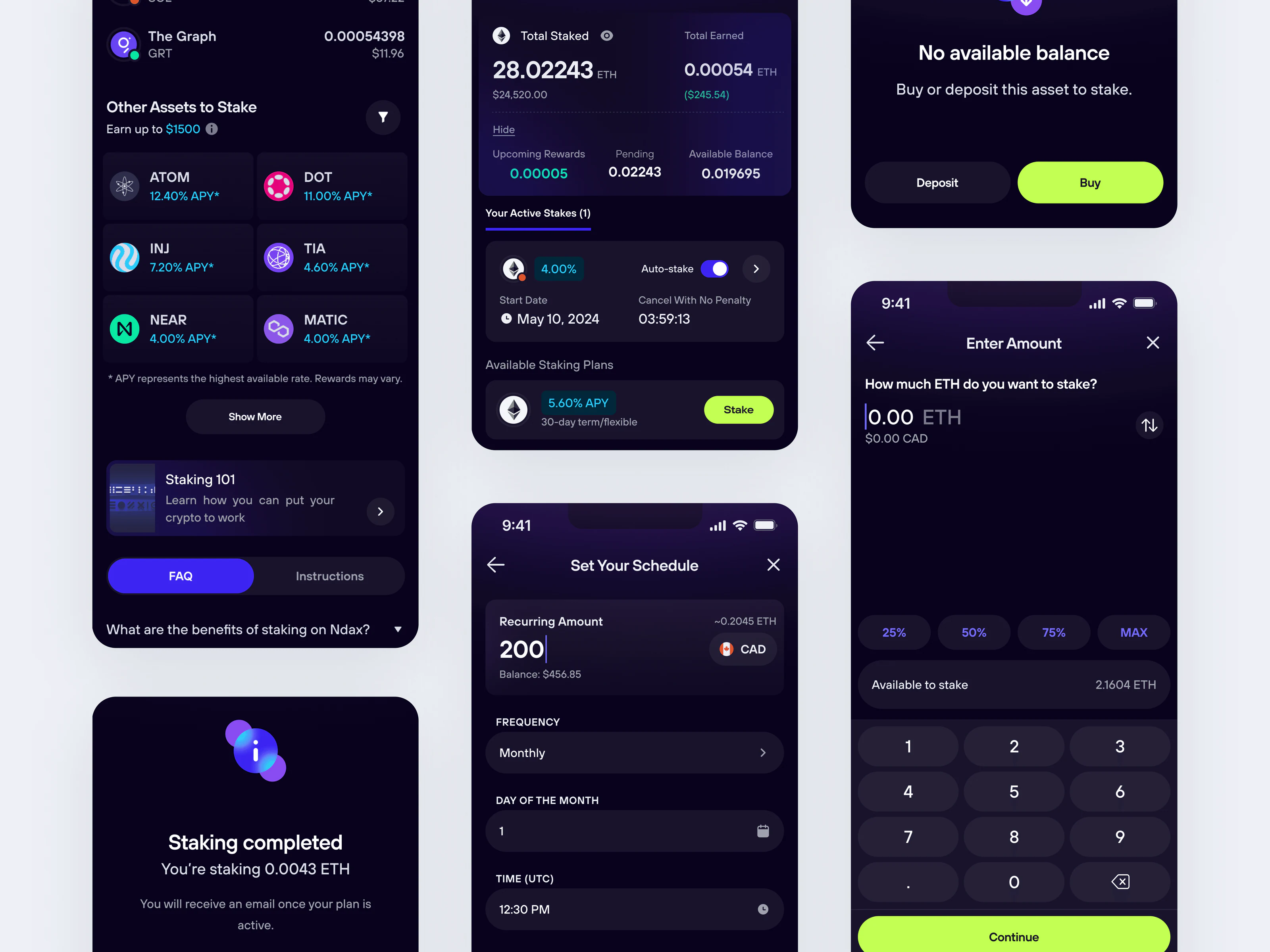
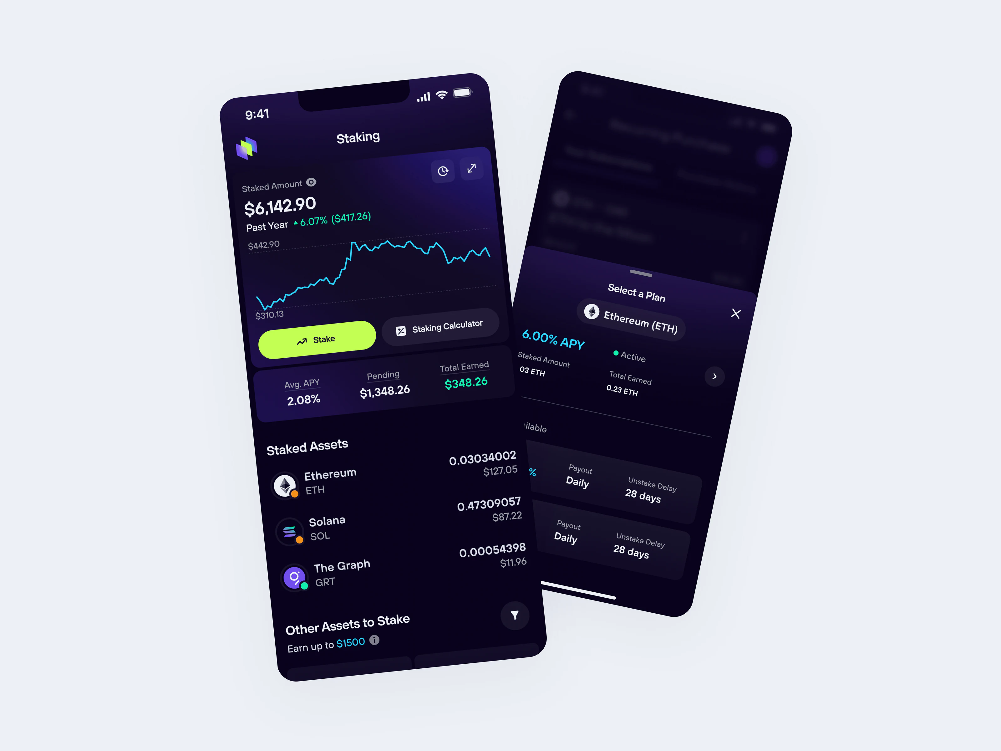
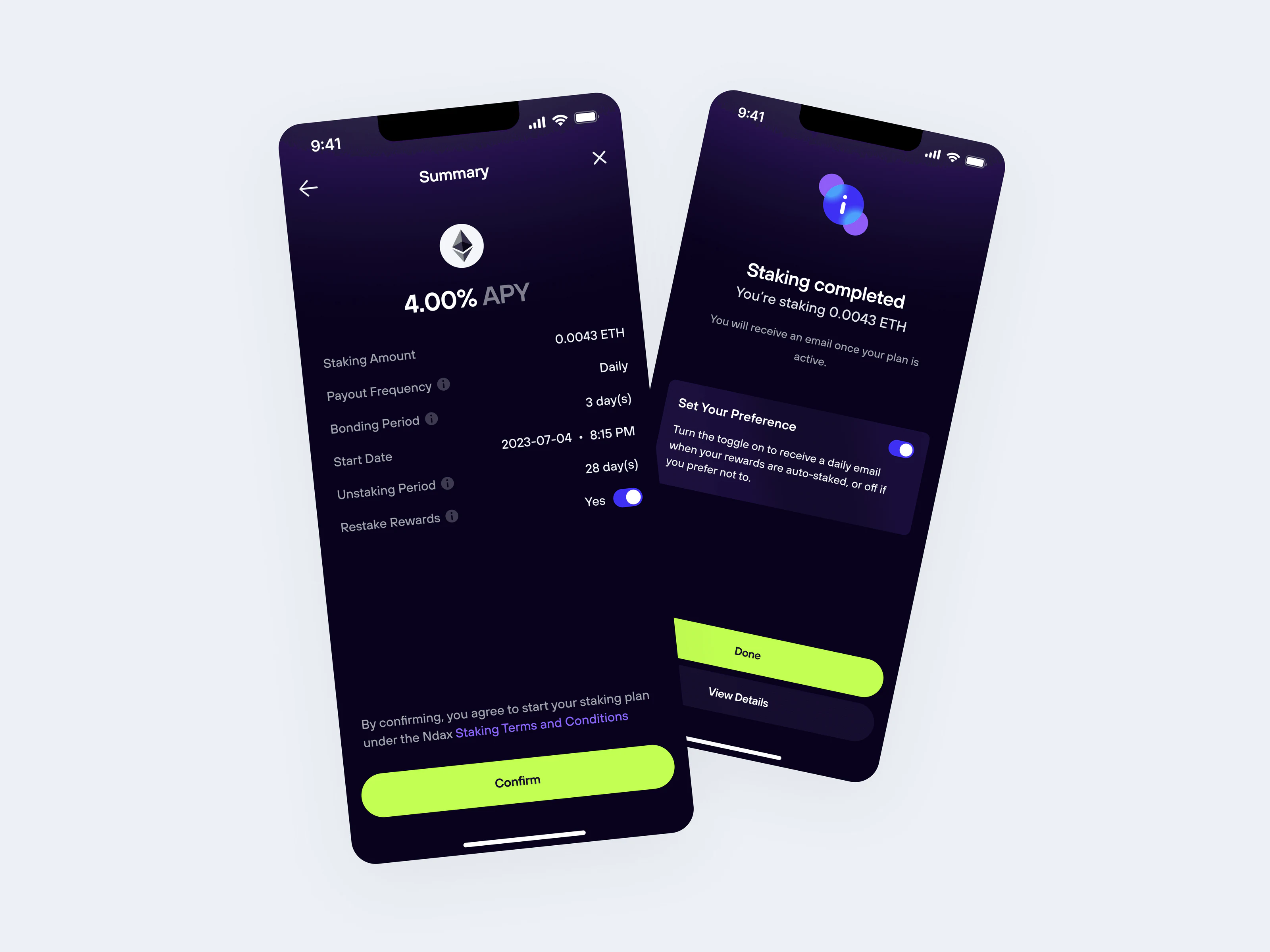
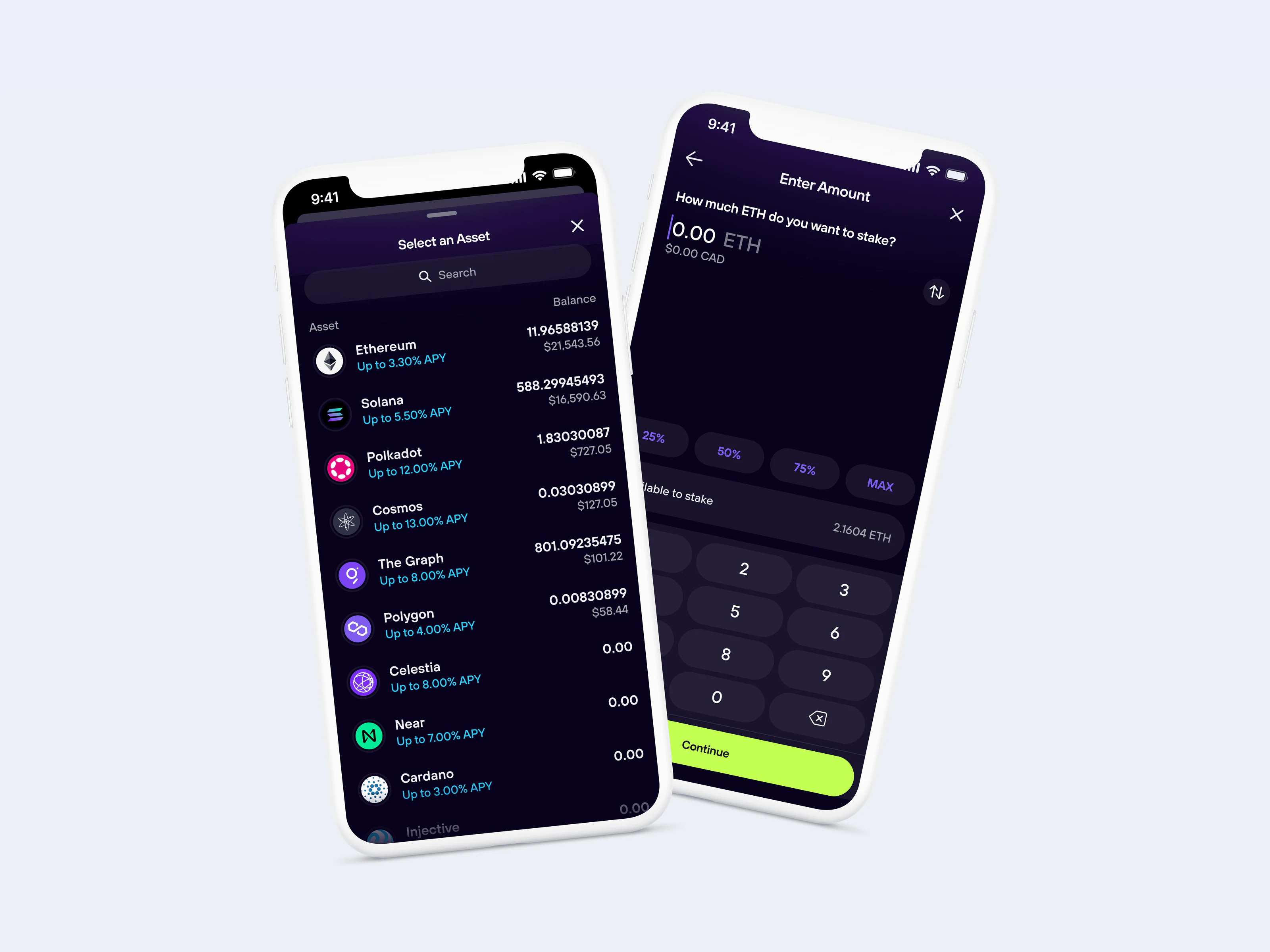
NDAX’s staking flow spread one decision across five screens: pick an asset, pick a plan, enter an amount, review, confirm. I restructured it into a state-driven interface that separates active positions from available plans, and lets people add funds or edit a schedule without restarting the flow.
- Role
- Product Designer, sole designer
- Company
- NDAX, a Canadian crypto exchange
- Year
- 2026
- Live
- ndax.io
The problem
Staking is a commitment of real money, so people need to know exactly where they stand before they lock up funds. The existing flow made that hard.
- The journey ran across several screens, so people lost context and couldn’t tell how far along they were.
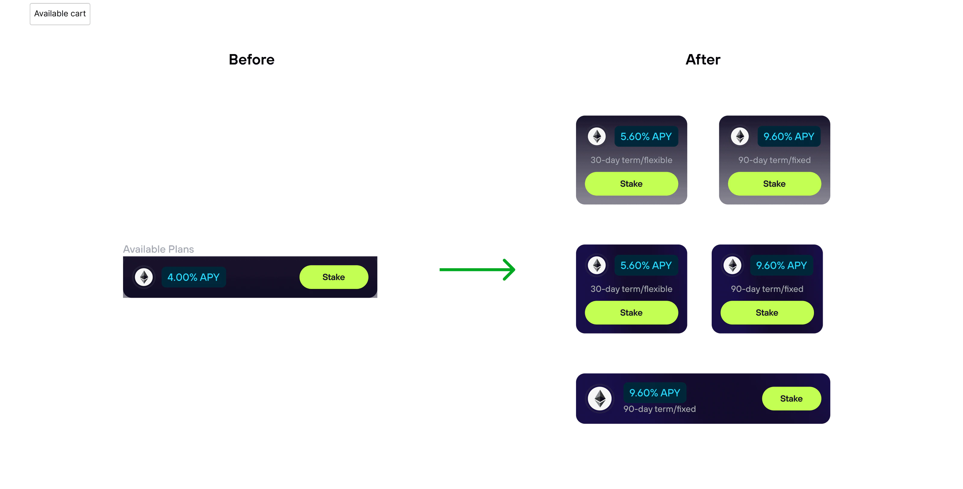
- Active and available plans looked almost identical, which blurred what someone already held and what they could act on.
- Choosing a plan, setting an amount, and scheduling were separate steps, so people had to piece the decision together themselves.
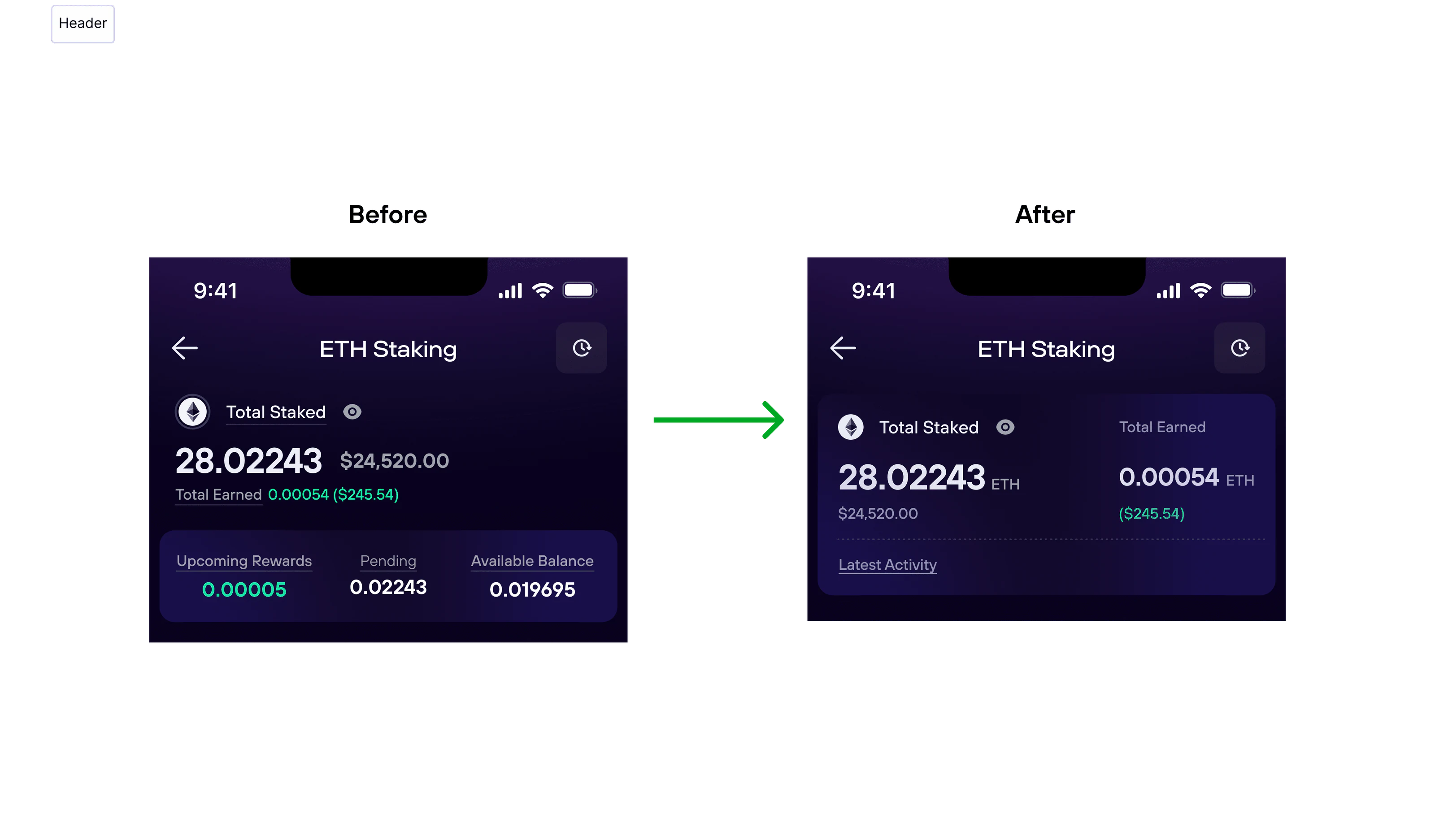
- There was no quick way to scan current staking status or see which actions were available.
- Key details were scattered right before confirmation, the moment confidence matters most.
The goal
Replace the linear flow with a structure built around the person’s current state.
- Make the current staking position clear at a glance.
- Separate active positions from available opportunities.
- Bring core actions into one place and cut the steps needed to complete them.
- Give enough visibility to decide quickly and with confidence.
Key decisions
- Restructured the flow. Condensed the multi-step process into a direct, streamlined path.
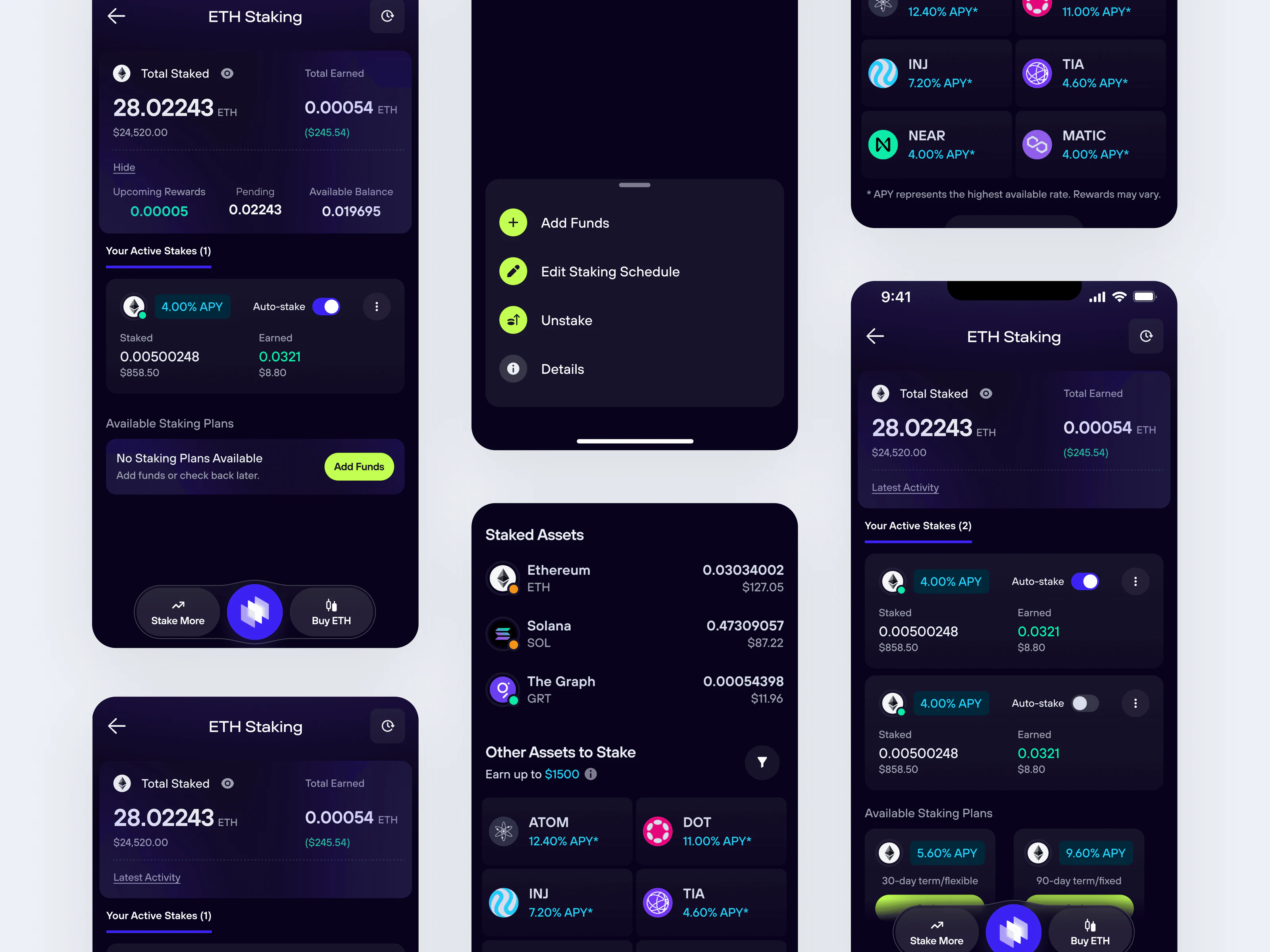
- Split active from available. Separate sections for what you own and what you can start, so the page scans by ownership.
- Raised what drives the decision. Balances, APY, and actions got more visual weight than supporting detail.
- Kept inputs in context. Amount and scheduling live inside the flow instead of on their own screens.
- Added quick actions. People can add funds or edit a schedule without going through the full flow again.
- Designed every account state. The same system works with several active plans, a single plan, or no available balance.
Outcome
Staking moved from a step-by-step process to a state-driven interface.
- People see their current staking position immediately.
- Common actions take fewer steps, and contextual controls make them faster.
- Clearer structure and hierarchy make the page easier to scan.
- One layout adapts to multiple, single, or no active plans.
- People have what they need to decide with confidence before committing funds.