Crypto withdrawals at NDAX
Sending crypto is final. One wrong field and the money is gone, with no bank to call and no chargeback. I rebuilt NDAX’s withdrawal flow to remove the ways a person can lose funds, without making a simple task feel scary. The screens look familiar on purpose: what changed is the structure that keeps money safe.
- Role
- Product Designer, end to end
- Company
- NDAX, a Canadian crypto exchange
- Platform
- iOS and Android
- Team
- PM, engineering, compliance
- Year
- 2026
What changed
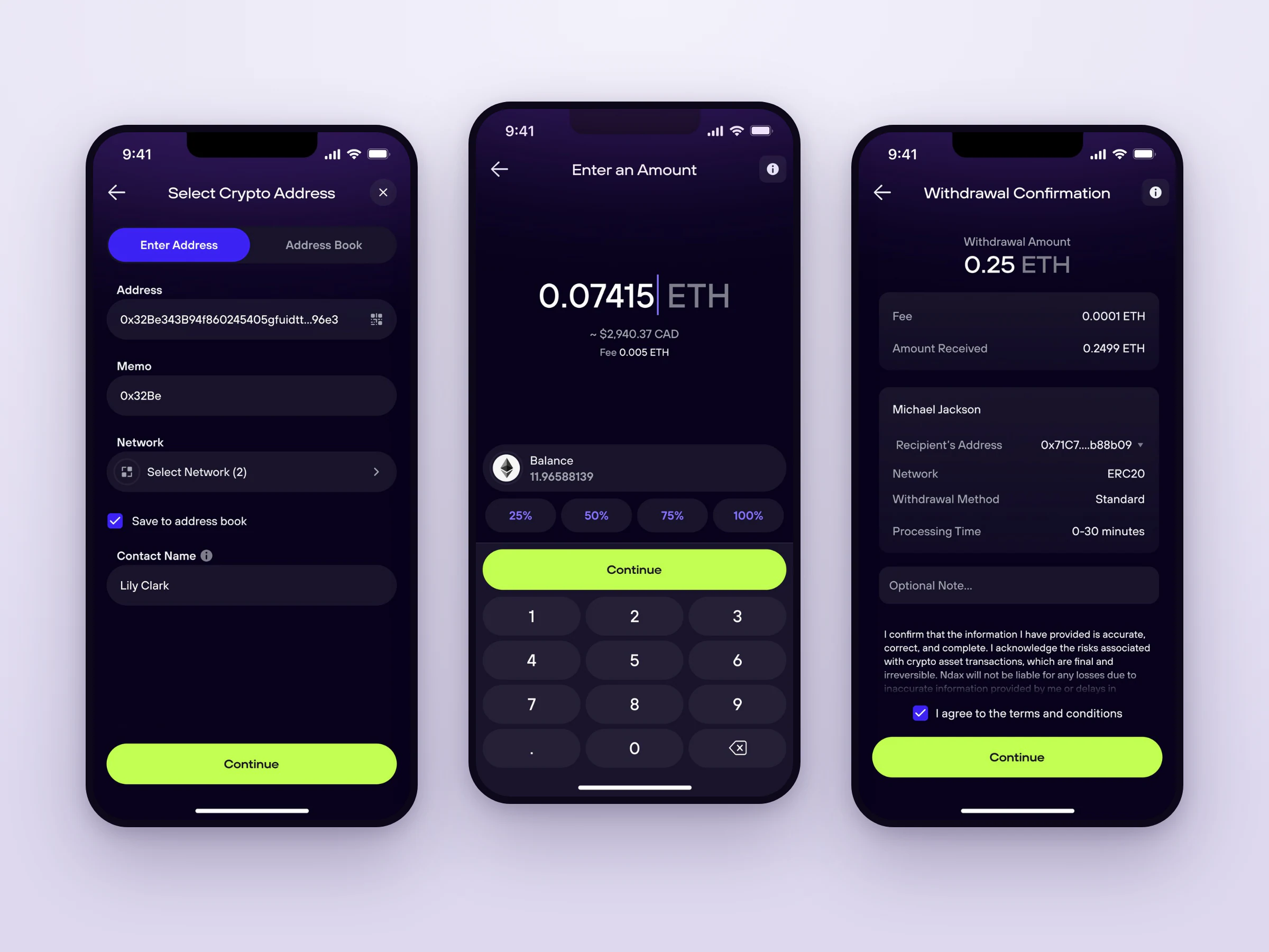
- Two steps became one. The separate network step moved into the address form, where the match with the address is visible.
- The fee comes first. Cost shows while you enter the amount, not as a surprise at the end.
- Built for a one-way action. Every send is final, so the flow prevents mistakes instead of trying to undo them.
Why it’s unforgiving
A withdrawal moves crypto off NDAX to an outside wallet. The person pastes a destination address, chooses the network it travels on, sets an amount, and sends. It sounds like a bank transfer, but it’s a one-way instruction broadcast to a public network that checks nothing about intent and can’t be recalled.
| Aspect | A bank transfer | A crypto withdrawal |
|---|---|---|
| Recipient | A name and account number, validated by the bank | A long address string, with no name and no check that it’s right |
| Mistakes | Often recallable or reversible | Irreversible: no chargeback, no reversal |
| Routing | One banking network handles it | You pick the blockchain network, and the same address can exist on several |
| Cost | Flat and known up front | A network fee that varies and reduces what arrives |
| Gotchas | None | Some coins need a memo or tag, or the funds are lost |
That shaped every decision: in crypto, the interface is the last line of defense.
The core tension
A withdrawal flow is pulled between two failure modes. Naming the target between them made every later trade-off easier to settle.
- Too much friction: safe but unusableWarnings on every field and confirmations on every tap. Nothing goes wrong because people give up, or panic and abandon a legitimate send.
- The target: a calm path, sharp at the risk pointsA light, fast happy path, with clarity rising exactly where money and risk move: the network, the fee, and the final review.
- Too little friction: fast but dangerousOne-tap send and no review. Effortless until the day someone picks the wrong network.
The tool for hitting the middle was progressive disclosure: keep the flow quiet by default and spend the person’s attention only where a mistake would be irreversible.
Where the old flow added risk
The old flow worked, but it put the two most dangerous decisions, the network and the cost, in the wrong places.
- The network stood alone. The address screen had no network on it. The one field that must match the address was chosen later, on its own screen, so the most expensive mistake in crypto was designed as a disconnected step.
- The cost was hidden. While entering the amount, people couldn’t see the network fee. The real cost appeared later, right before an irreversible send.
The old form wasn’t crowded. It was sparse. The risk was in the structure, not the clutter.
The redesigned flow
One calm, guided path. For each screen: what it’s for, why it matters, and the decision I made.
-
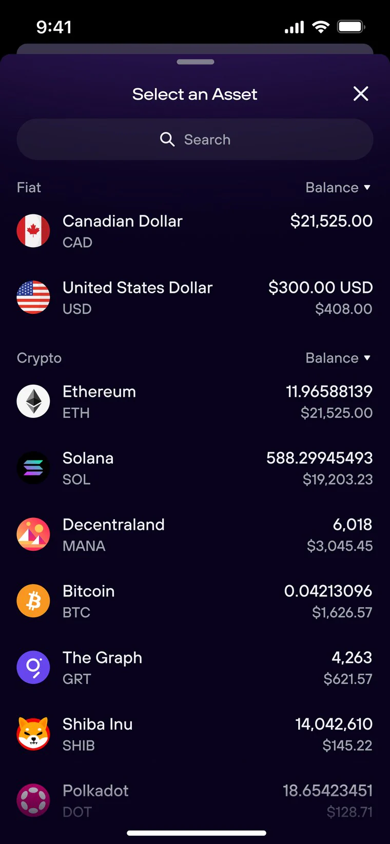
Step 1: Pick an asset
Choose what to send, lightly
Picking a coin is a small, reversible choice, so it shouldn’t feel like entering a big, risky task.
Decision: a bottom sheet, not a full screen. The full-screen task starts only once the asset is chosen, so the weight of the flow matches the weight of the step.
-
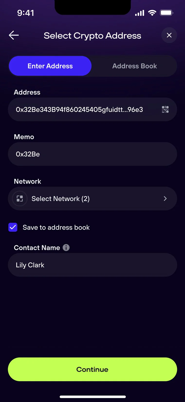
Step 2: Address and network
The fix that mattered most
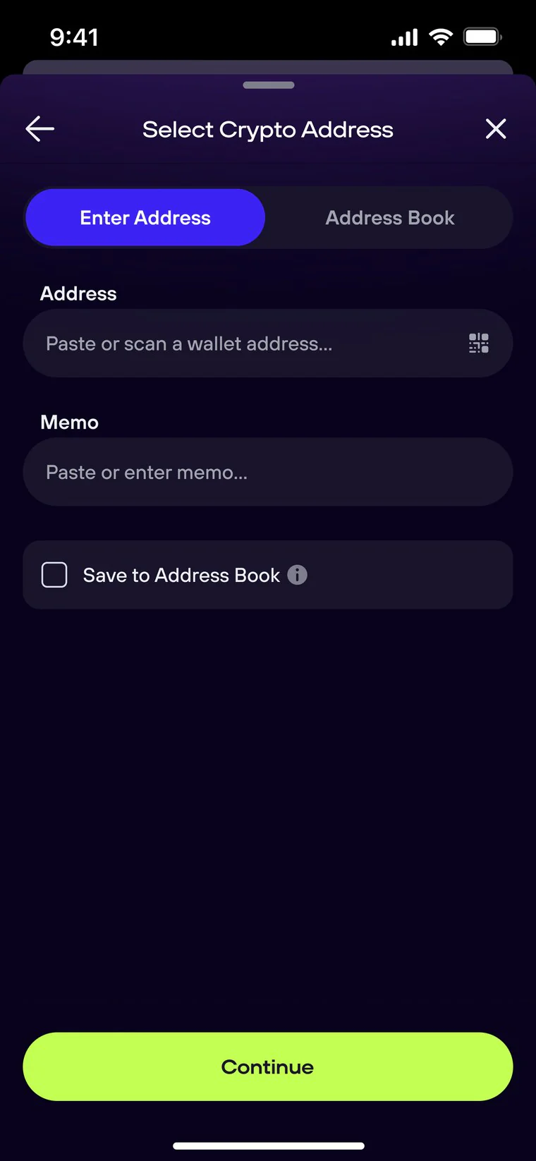
The address and the network must match, and a mismatch is the irreversible, money-losing mistake. The network now lives inside the address form, right under the address, so the two things that must agree are seen together.
Decision: network in the form, not on a later step. “Contact name” appears only after the person ticks “Save to address book”, so the form asks for a name only when it’s relevant.
-
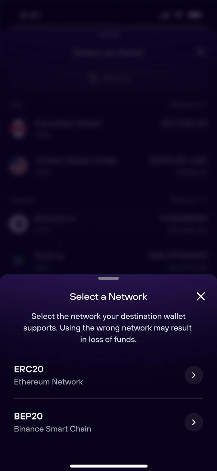
Step 3: Network picker
The riskiest choice, made explicit
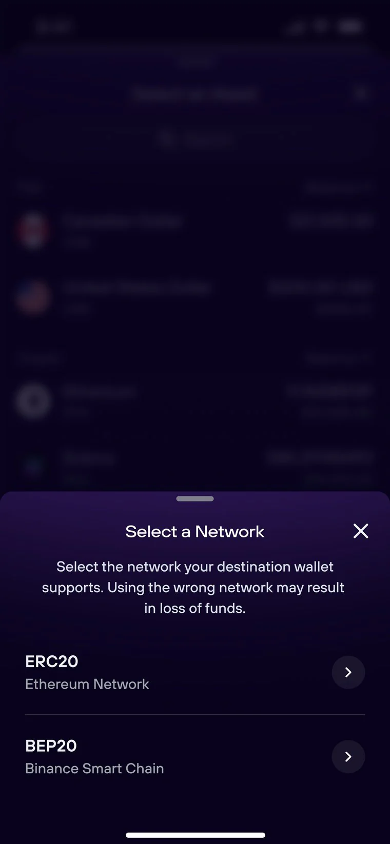
Tapping the network field opens a picker (ERC-20, BEP-20 and others). This is the exact point where a wrong tap loses funds, so the picker opens from the address form and carries a plain warning that the wrong network can mean loss of funds.
Decision: spend attention here on purpose. I didn’t soften the warning for the sake of a cleaner screen. This is one of the few places friction earns its keep.
-
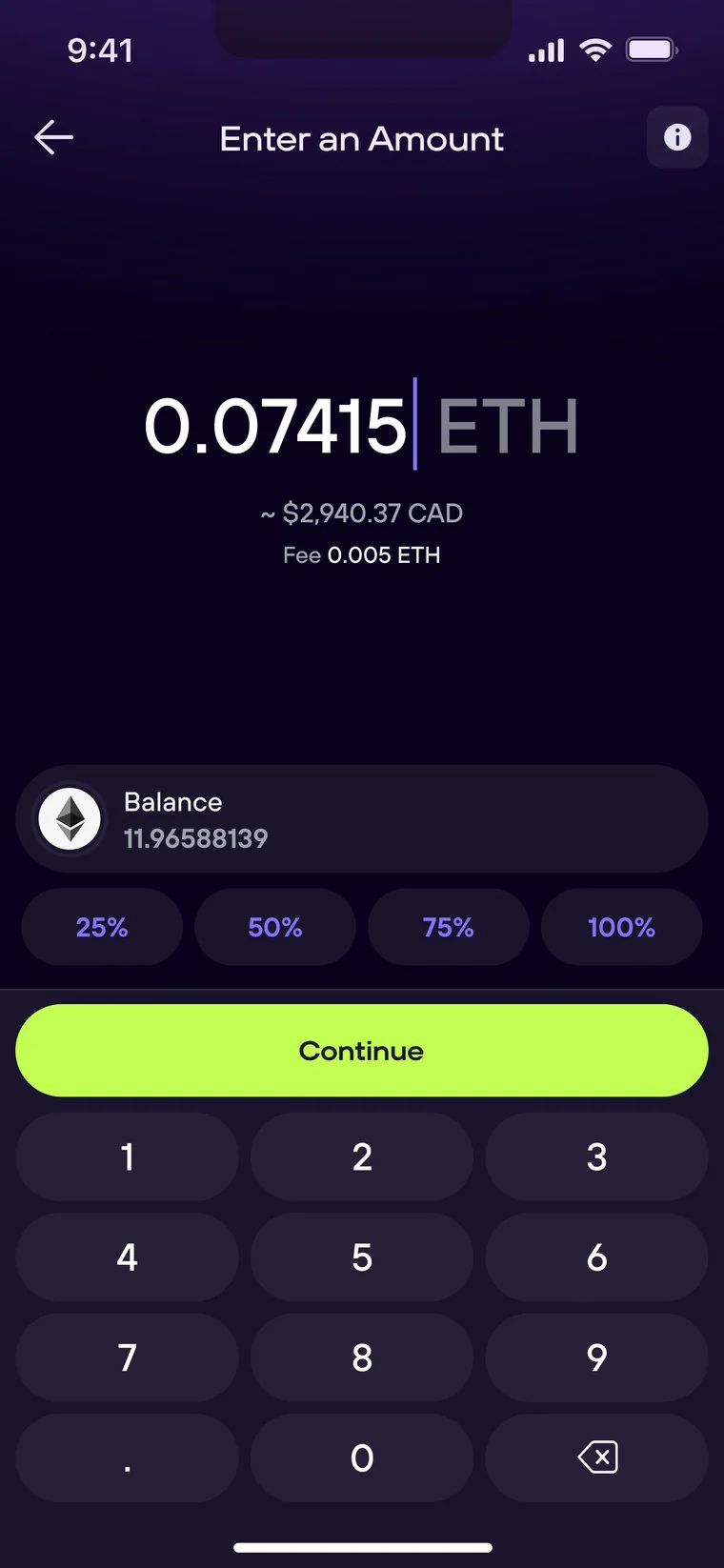
Step 4: Amount and fee
Cost before commitment
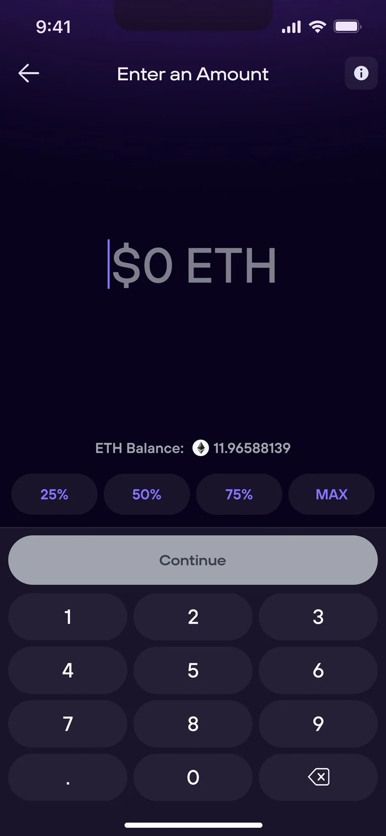
The network fee quietly reduces what the recipient receives, and a surprise cost at the end breaks trust. The fee now shows directly under the amount as the person types.
Decision: fee visible at entry, not buried in the review. Honesty at the moment of choice, not after it.
-
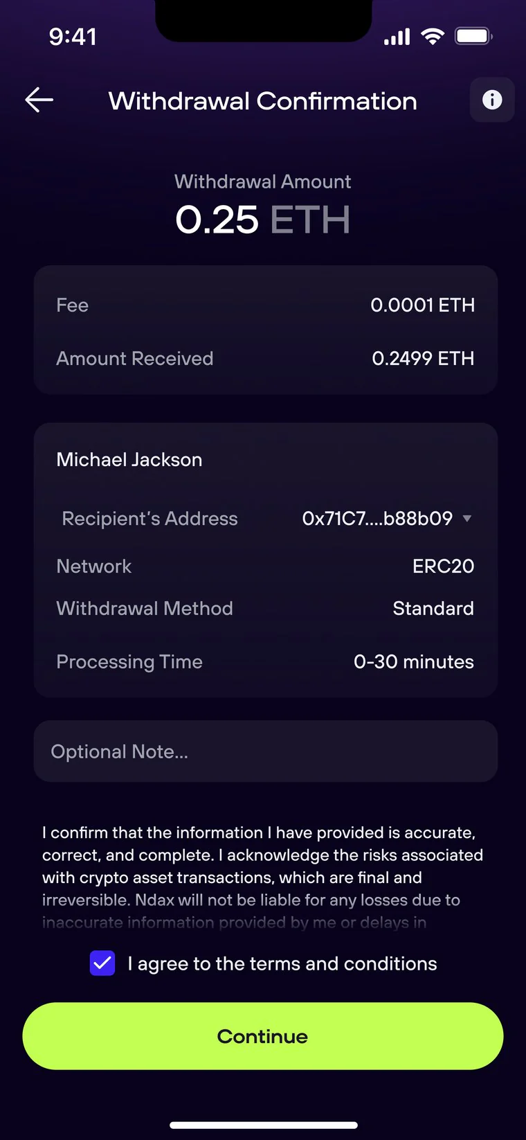
Step 5: Review and confirm
The deliberate last stop
A final check of the amount, fee, amount received, recipient, and network. After this there is no undo, so the review itemizes the real numbers and locks the network: you can check it, but not change it by accident at the last second.
Decision: the review is for checking, not editing. It’s the one screen where the flow deliberately slows down.
The hard calls
Keeping address and network together
Chose: a network field inside the address form that opens an explicit picker with a warning.
Rejected: auto-detecting the network from the address. The same address format exists across chains, so a confident wrong guess is worse than asking. I also rejected keeping it a separate step, which is what hid the relationship and caused wrong-network sends.
When to show the fee
Chose: the fee live under the amount, as the person types.
Rejected: showing the fee only at review. The cost would land as a surprise at the final step, where it reads as a bait-and-switch and drives abandonment right before an irreversible action.
Where whitelisting belongs
Chose: managing whitelisted addresses in the address book, outside the send flow.
Rejected: a whitelist toggle in the flow. It forces every first-time sender to reason about an advanced security concept mid-transaction. Outside the flow it’s still there for power users.
How much to ask up front
Chose: revealing “Contact name” only when the person chooses to save the address.
Rejected: always showing it, which adds clutter to the common one-time send, and never offering it, which makes repeat senders re-type long addresses by hand, the most error-prone thing in an irreversible flow.
Edge cases
- Method follows network. The review shows a withdrawal method, such as Standard, tied to the chosen network, so the two never contradict each other.
- Memo only where it’s real. Coins that need a destination tag show the memo field next to the address. Coins that don’t never see an empty, confusing input.
- Reuse a saved address. A returning sender picks a saved address with its network already attached, instead of re-entering the riskiest fields by hand.
How I worked
- Design reviews with the PM, engineering, and compliance. The network and whitelist calls came out of those reviews.
- Prioritized with the PM and engineering lead what shipped first and what came later.
- Built every screen from the existing design system, so the flow felt native on day one.
How I’d validate it
- Concept-test the reordered flow: do address and network together read as one decision, not two?
- Usability-test the two riskiest moments: choosing the network and the final review.
- Track the metrics tied to each hypothesis: wrong-network support tickets, first-send completion, and confirm rate.
What I took from it
- Structure beats decoration. The biggest risk reduction came from moving one field, not from restyling anything.
- Spend friction where it’s earned. Most of the flow should be quiet. The skill is choosing the few moments that deserve full attention: the network, the fee, and the review.
- Simpler is not emptier. The journey got simpler without losing anything a person needs to move money safely. The warning stayed, the cost got louder, and the path got calmer.
- Measure comprehension, not clicks. The real success metric is whether a first-timer understands the network choice they just made.