Public website and design system at Embark
An RESP is a government-backed education savings plan most parents don’t understand yet, so Embark’s website has to teach before it can sell. Research showed parents’ confidence breaking twice: while researching and while opening an account. As the sole designer, I aimed four redesigns at those two moments and moved about 90% of the live site onto a design system I built.
- Role
- Product Designer, sole designer on the website
- Company
- Embark, an RESP provider
- Year
- 2025–2026
- Scope
- About 90% of live pages, IA, design system
- Live
- embark.ca
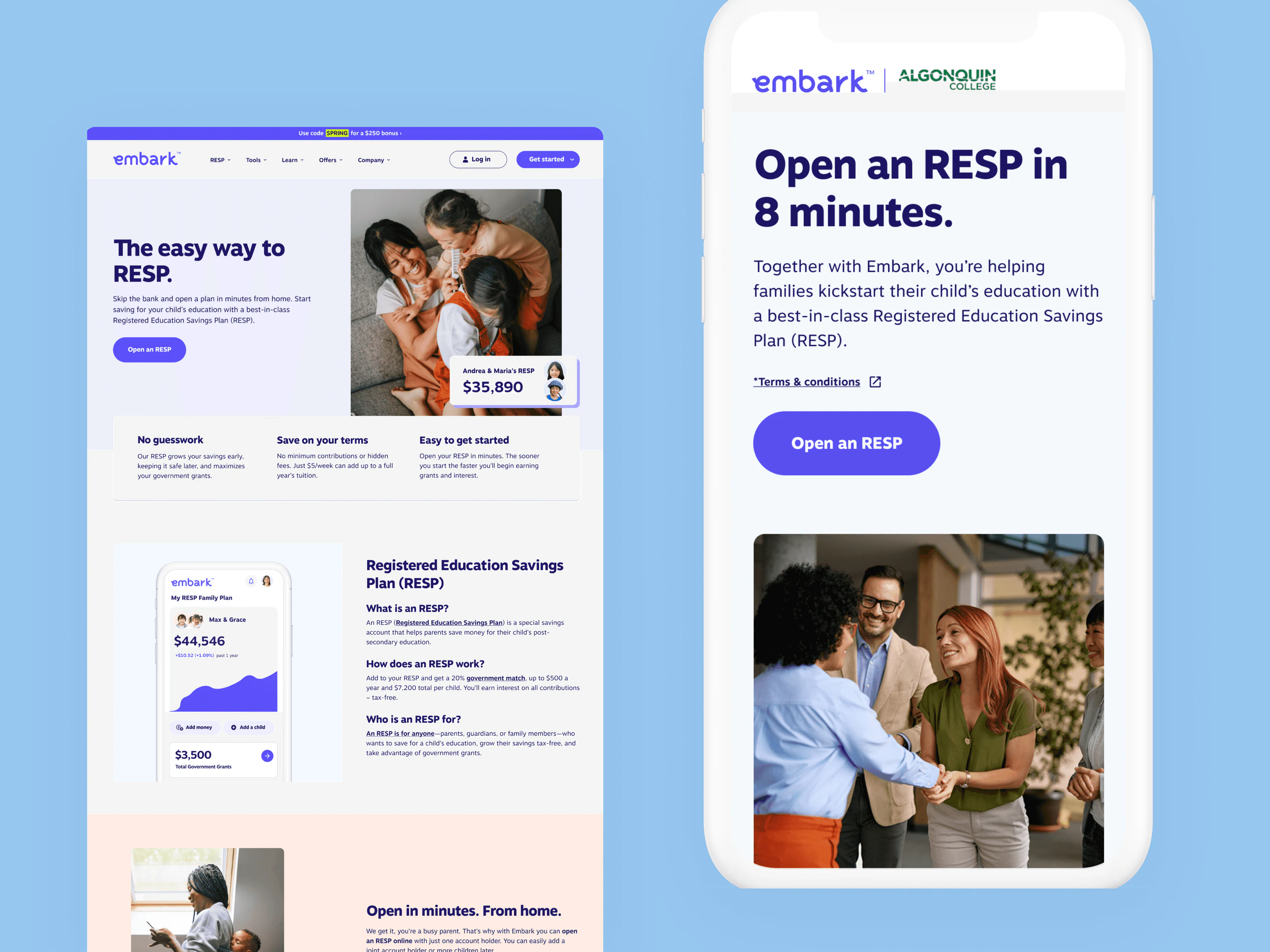
What Embark sells
Most parents come to Embark to understand, not to sign up. The public site is the product’s first act of teaching, and it has to make this click quickly:
- Parents save. A family puts money aside for a child’s education, from as little as $5 a week.
- The government adds. Grants top it up with a 20% match, up to $7,200 per child.
- It grows tax-free. Contributions and grants compound inside the plan.
- It pays for school. When the child starts post-secondary, the money comes back out for tuition.
That’s four ideas to land with someone who has never heard the word “RESP”, before asking them for a dollar or a document.
Where confidence breaks
Parent interviews, competitor and education-tool reviews, and Embark’s customer journey research all pointed the same way. Confidence is high once people get it, but it collapses twice: while researching, when information is conflicting and full of jargon, and while opening an account, when forms, ID checks, and the fear of a costly mistake pile up.
The old site made both worse. Every page had invented its own hierarchy, copy defaulted to finance-speak, and one navigation served two very different people. It wasn’t an aesthetics problem but a systems problem: inconsistency was reading as untrustworthiness.
My working thesis: in a product people don’t trust yet, clarity is the feature. So I rebuilt the structure first, with one hierarchy and one content pattern, then re-laid every page against it. Each of the four bets below targets one of the two dips.
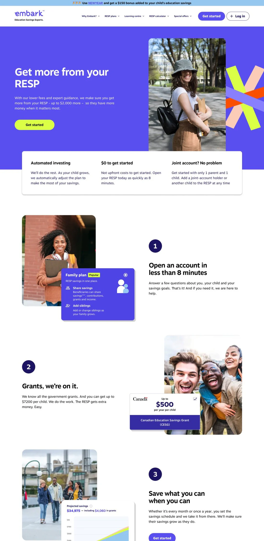
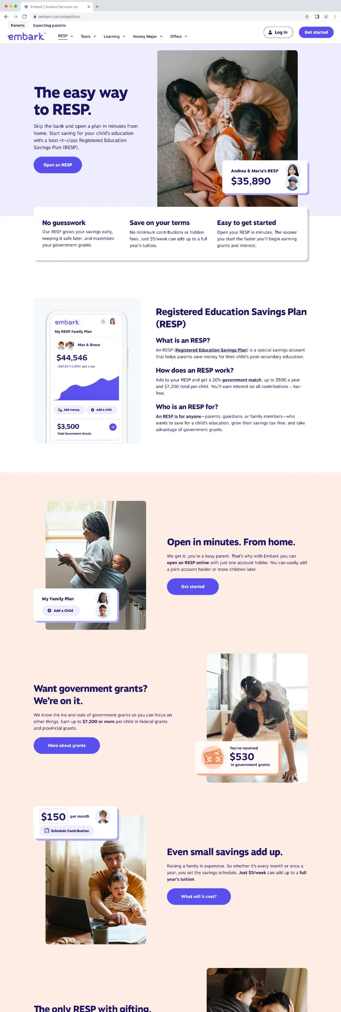
Bet 1: a homepage with one next step
- Problem. Not thin content but competing content. Five messages of equal weight meant the reader picked none.
- Change. One top-to-bottom flow, sequenced by what a new parent needs to know first, with one primary action and everything else supporting it.
- Hard call. Stakeholders each had a “most important” block. I anchored every keep-or-cut decision to the parent’s first real question instead of internal priority, which meant cutting things people were attached to.
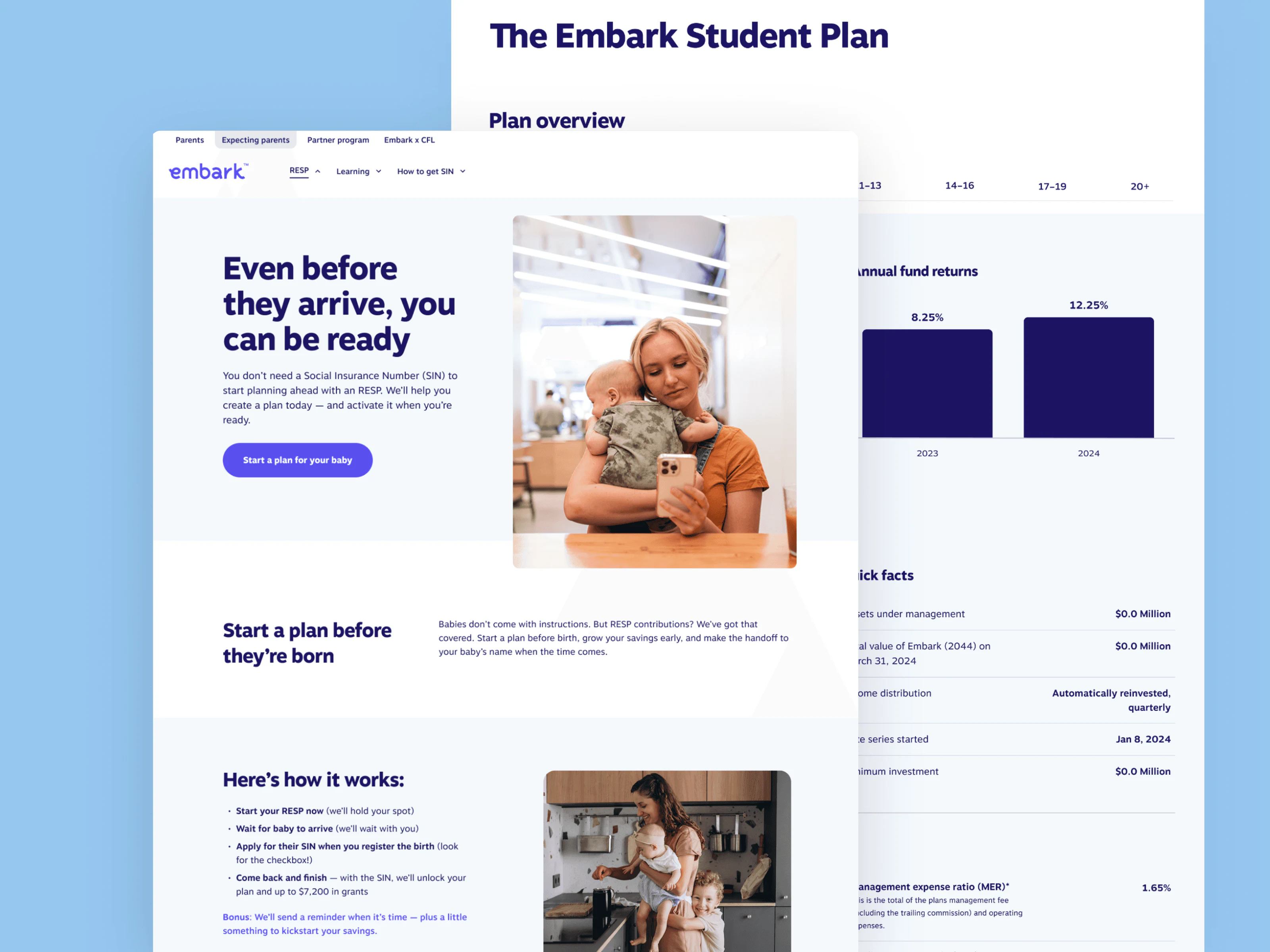
Bet 2: navigation split by who you are
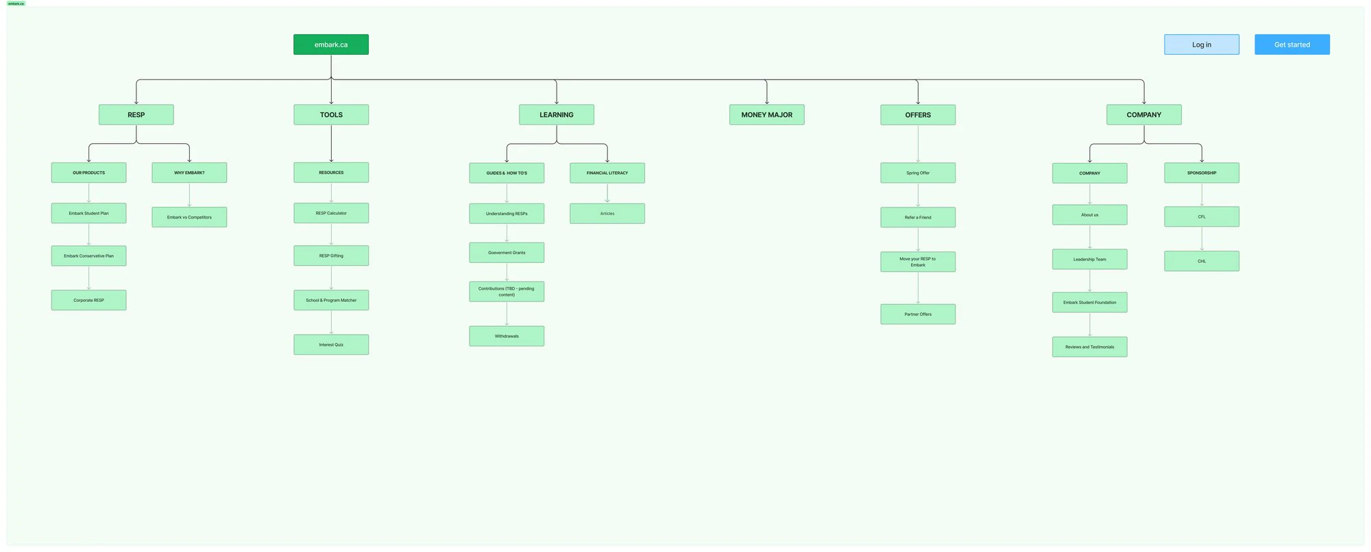
- Problem. A parent and an expecting parent are at different life stages with different questions, and one menu served neither well.
- Change. The top level now splits by who the user is, Parents and Expecting parents, instead of filtering one shared menu, with the information architecture rebuilt underneath. Partly modeled on how Wealthsimple leads with intent rather than product categories.
- Hard call. More surface to maintain, and a bet that people self-identify correctly on entry. I judged a lost user more expensive than a heavier tree, and flagged the assumption for validation.


Bet 3: route returning users before they make a mistake
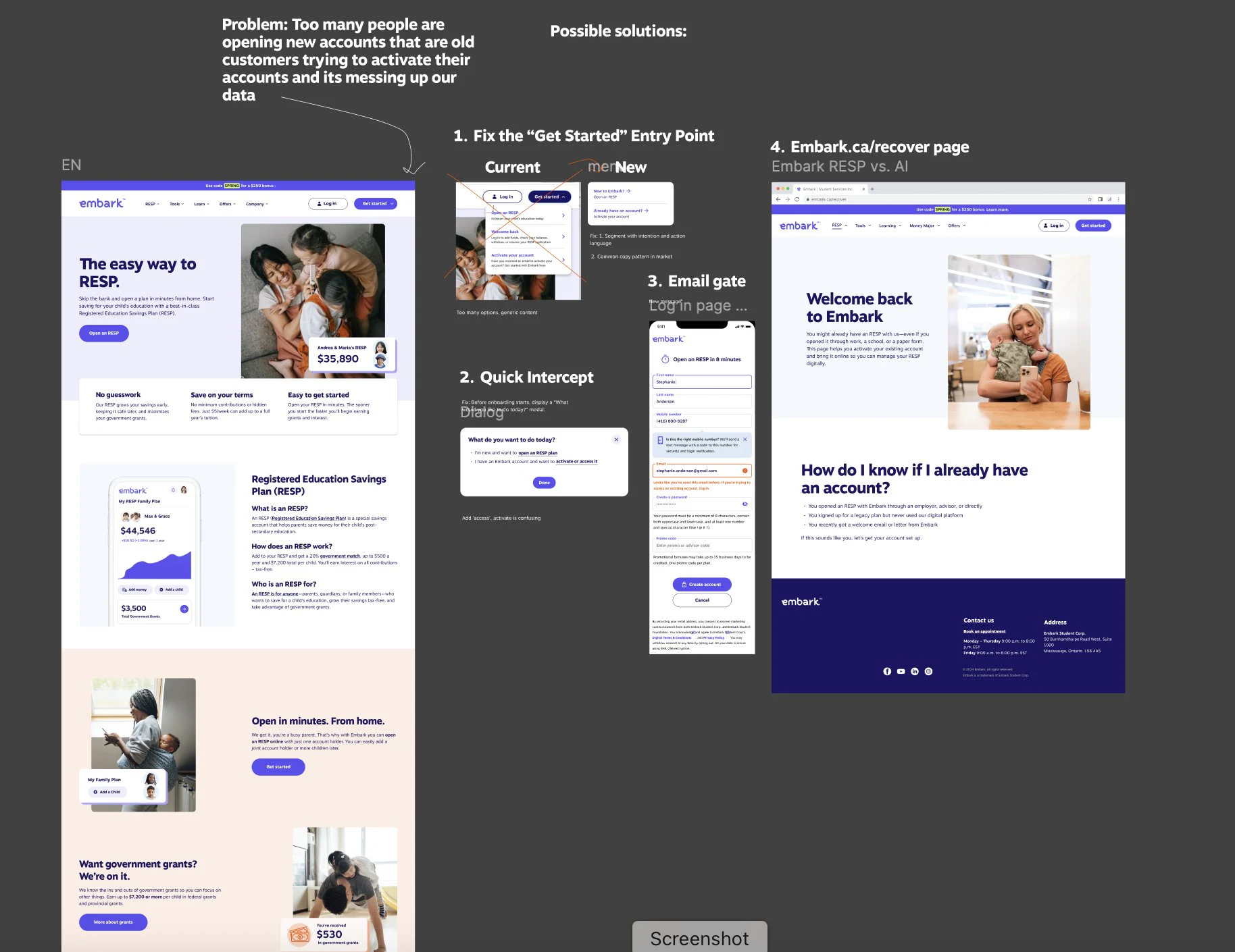
- Problem. Returning customers were creating new accounts. The entry point couldn’t tell “new” from “back”, which led to duplicate accounts, messy data, and support tickets.
- Change. An intent check at “Get started”, an email check that sends existing customers to sign-in, and a dedicated recover page for plans opened offline.
- Hard call. One extra step at the top of the funnel, normally friction to avoid. Here it removed a much larger, invisible cost further down.
| Who taps “Get started” | Where they go |
|---|---|
| New to Embark | Straight into onboarding |
| Already has an account | Email check, then sign-in instead of a new account |
| Has a plan opened offline | A recover page to activate it |
Bet 4: explain before you ask
People dropped off when asked for a SIN and government ID, not because the step was hard but because nothing explained why. In a financial product, silence reads as risk. The fix wasn’t fewer fields. It was context, delivered exactly where the fear lives.
Before
Social Insurance Number (SIN)
No reason given, so people stall or leave.
After
Social Insurance Number (SIN)
Why we ask: Your SIN confirms your identity for tax purposes, as our regulator requires. It’s protected and securely encrypted.
“Why do you need this?” is answered at the moment of the ask, in tooltips and supporting copy, instead of three clicks away in a policy page. Transparency as friction reduction, not friction.
Result: on the improved verification path, 86% of people completed the step where they used to stall.
One connected system
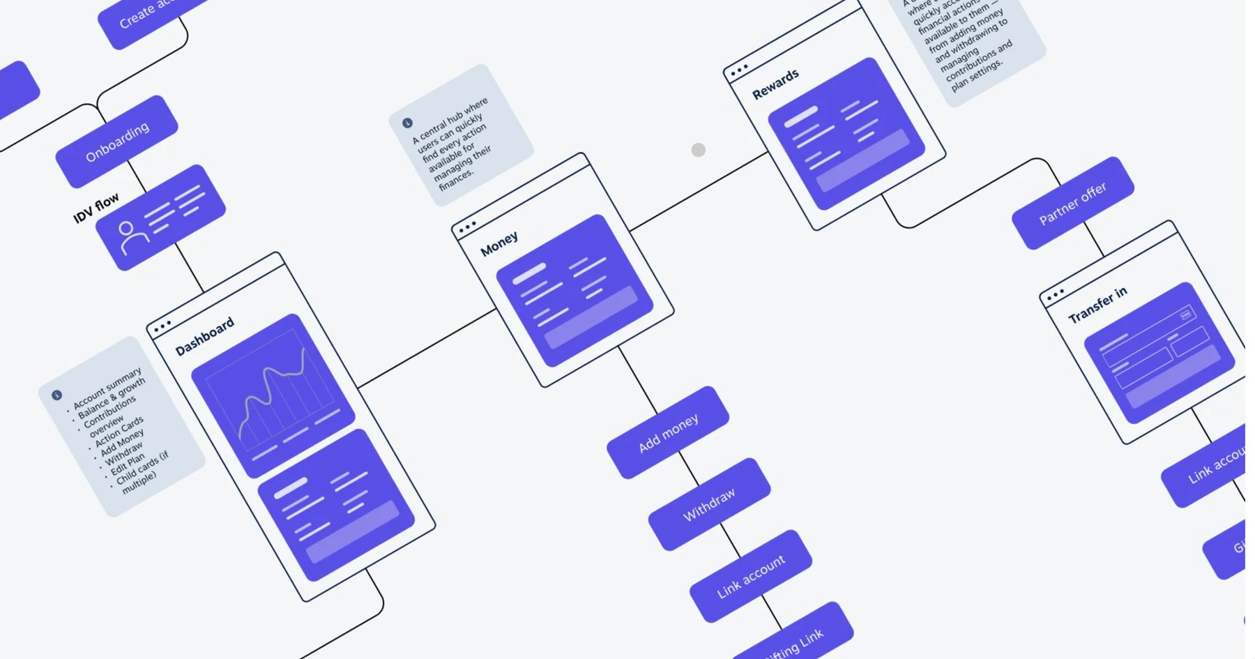
Onboarding, ID verification, the dashboard, money movement, and transfer-in were mapped as one flow, so no screen was designed in isolation and the trust built on one carried to the next.
The design system
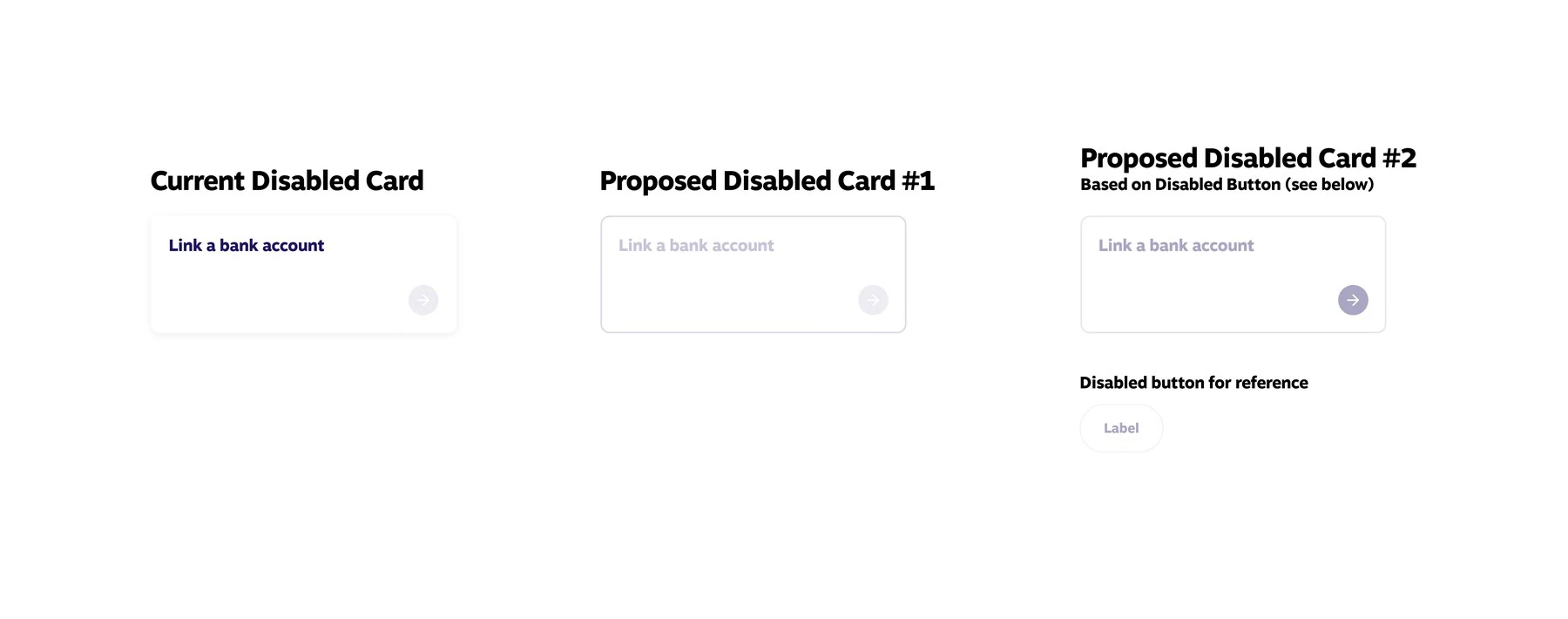
- Problem. The same component behaved differently across pages, and inconsistency at the component level is inconsistency everywhere.
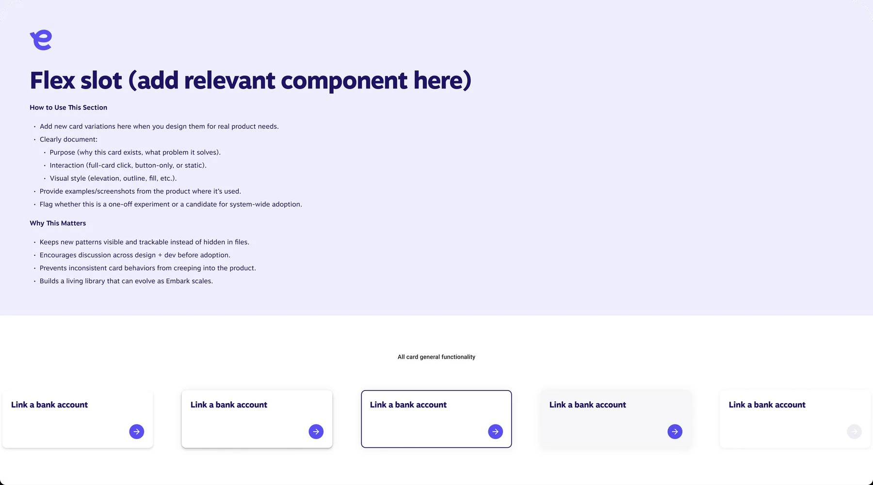
- Change. Repaired component states and added a governed “flex slot” for new patterns, documented in the open instead of hidden in files.
- Decision. Fix the system in parallel with the pages, so every future page inherits the fix for free.
Also redesigned
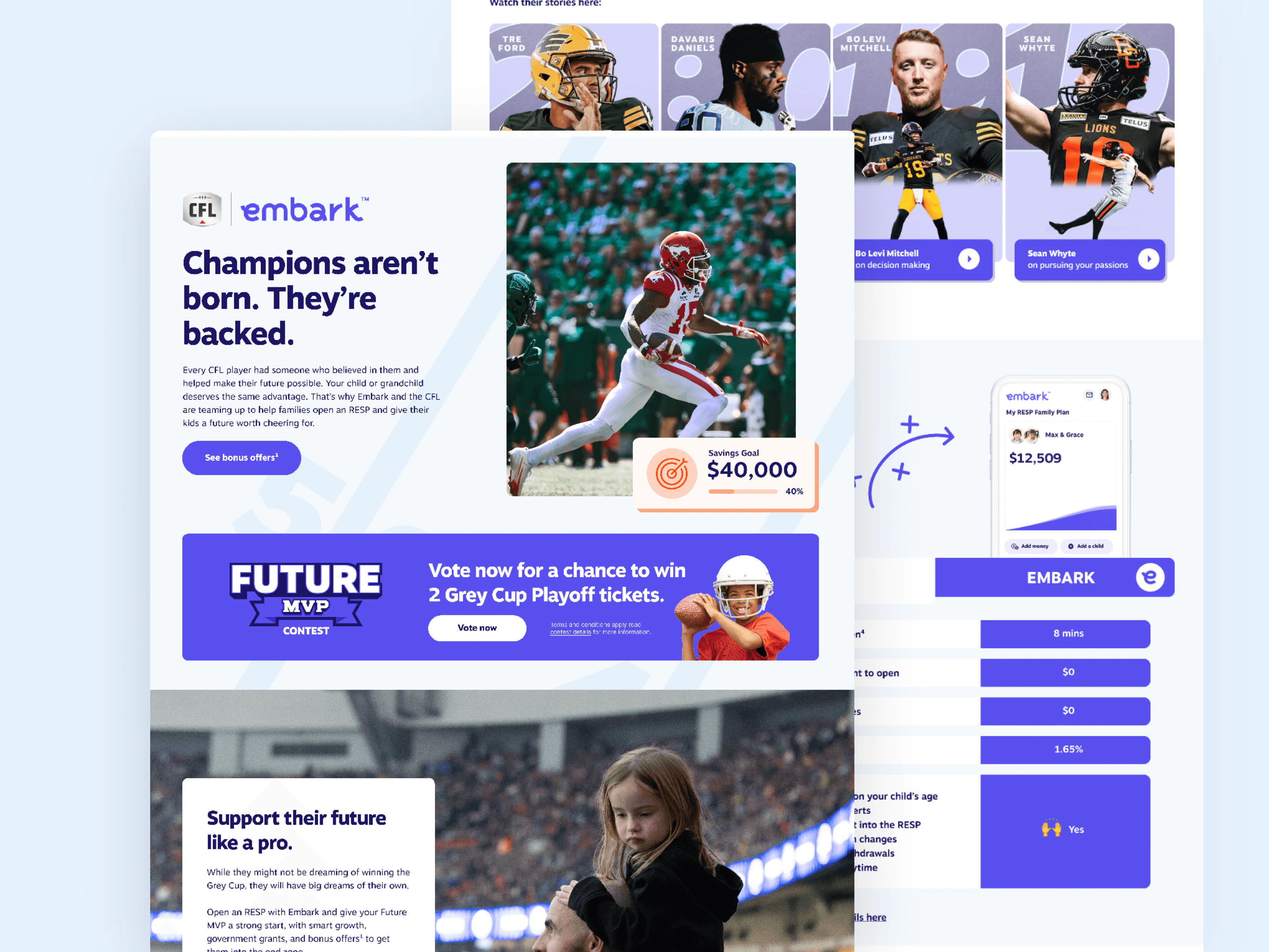
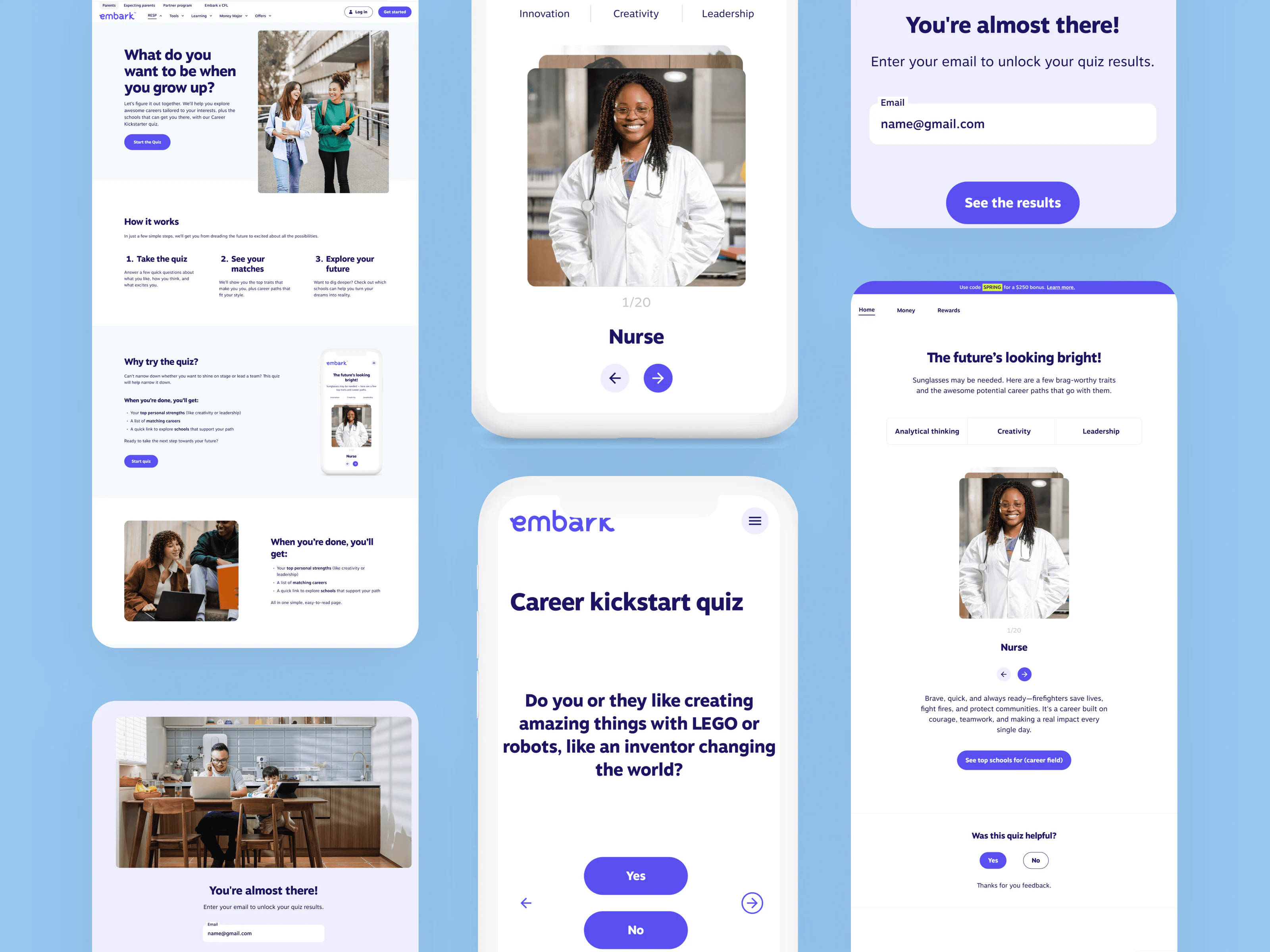
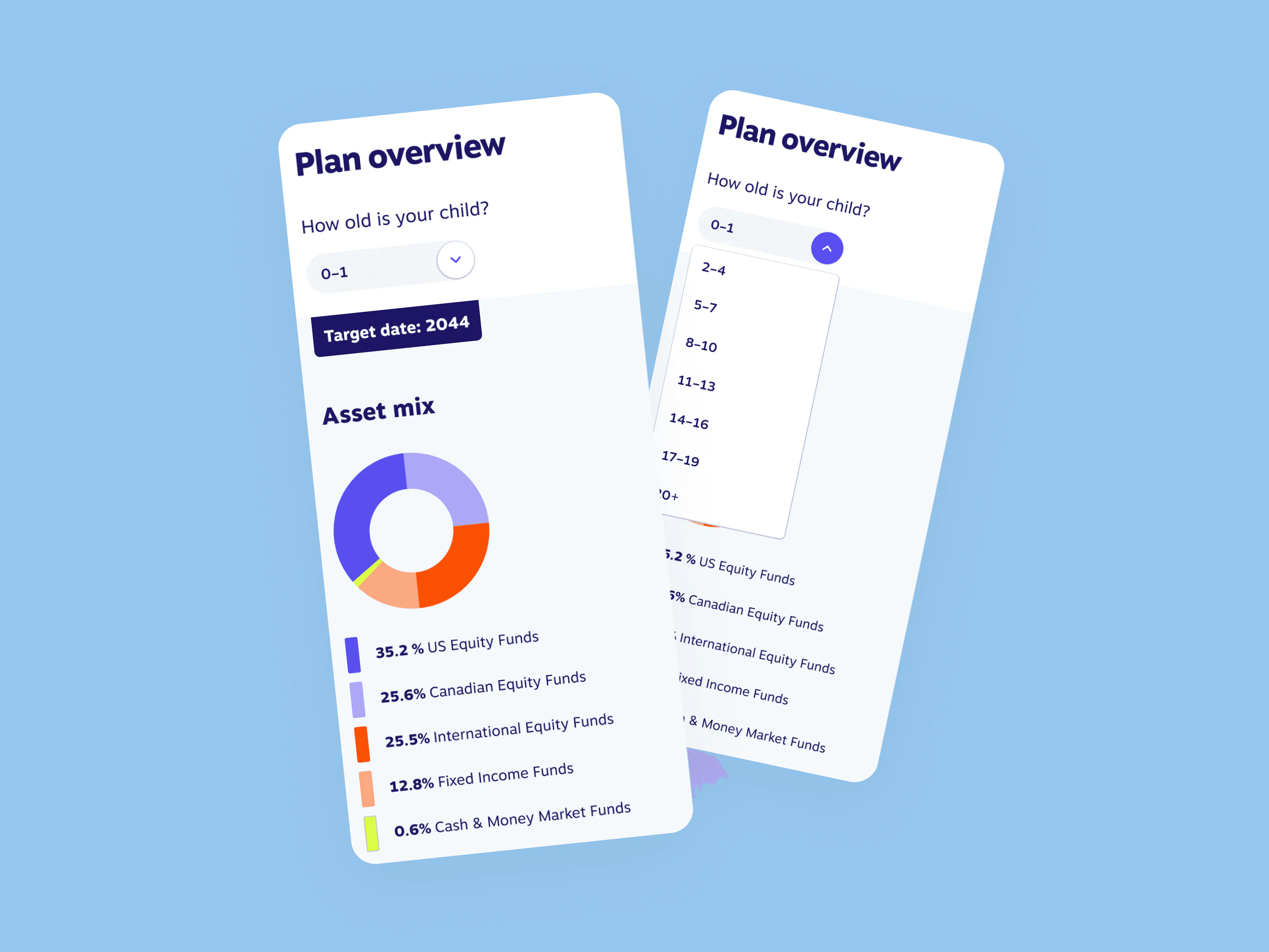
Tools and pages across the site: the Career Kickstart Quiz, the Career & School Matcher, a Partnerships page for programs like CFL, UFT, and PolicyMe, the RESP product and tools pages, the Embark Student Foundation, Refer a Friend, How to Get a SIN, and login and sign-up.
Outcome
- 86% verification completion on the improved path, at the step where parents used to stall.
- About 90% of live pages rebuilt on one consistent system.
- Cleaner entry. Returning customers are routed to sign-in instead of into a duplicate account.
The same nervous parent is now guided through both dips, on a foundation that scales instead of one-off pages.
What I’d do differently
- Instrument earlier. A clean quantitative baseline before the redesign, not directional funnel data reconstructed afterwards.
- Test verification at scale. It’s where trust is most fragile. I validated it qualitatively, but not with moderated testing at scale before shipping.
- Validate the navigation split. It assumes people correctly identify as a parent or an expecting parent. I never measured how often they don’t, and that’s the first thing I’d close.
This project taught me to simplify a genuinely complex system without dumbing it down, for people new to the whole category, not just the product.
“Her impact at Embark was significant, helping to shape our comprehensive web redesign and defining a digital experience that fostered trust, authenticity, and clarity for families planning their futures.”