
NDAX (Crypto Staking Experience)
Overview
This project focused on improving a crypto staking experience by simplifying how users understand, manage, and act on staking decisions.
The existing flow required users to move through multiple fragmented steps (selecting assets, choosing plans, entering amounts, reviewing, and confirming), which made the experience harder to follow and increased friction—especially in a financial context where clarity and confidence are critical.
The goal was to redesign the experience to make staking more intuitive, reduce cognitive load, and help users make decisions with confidence.
Role
UI/UX Designer


Challenges
From the audit of the current experience, several key issues emerged:
Fragmented interaction flow
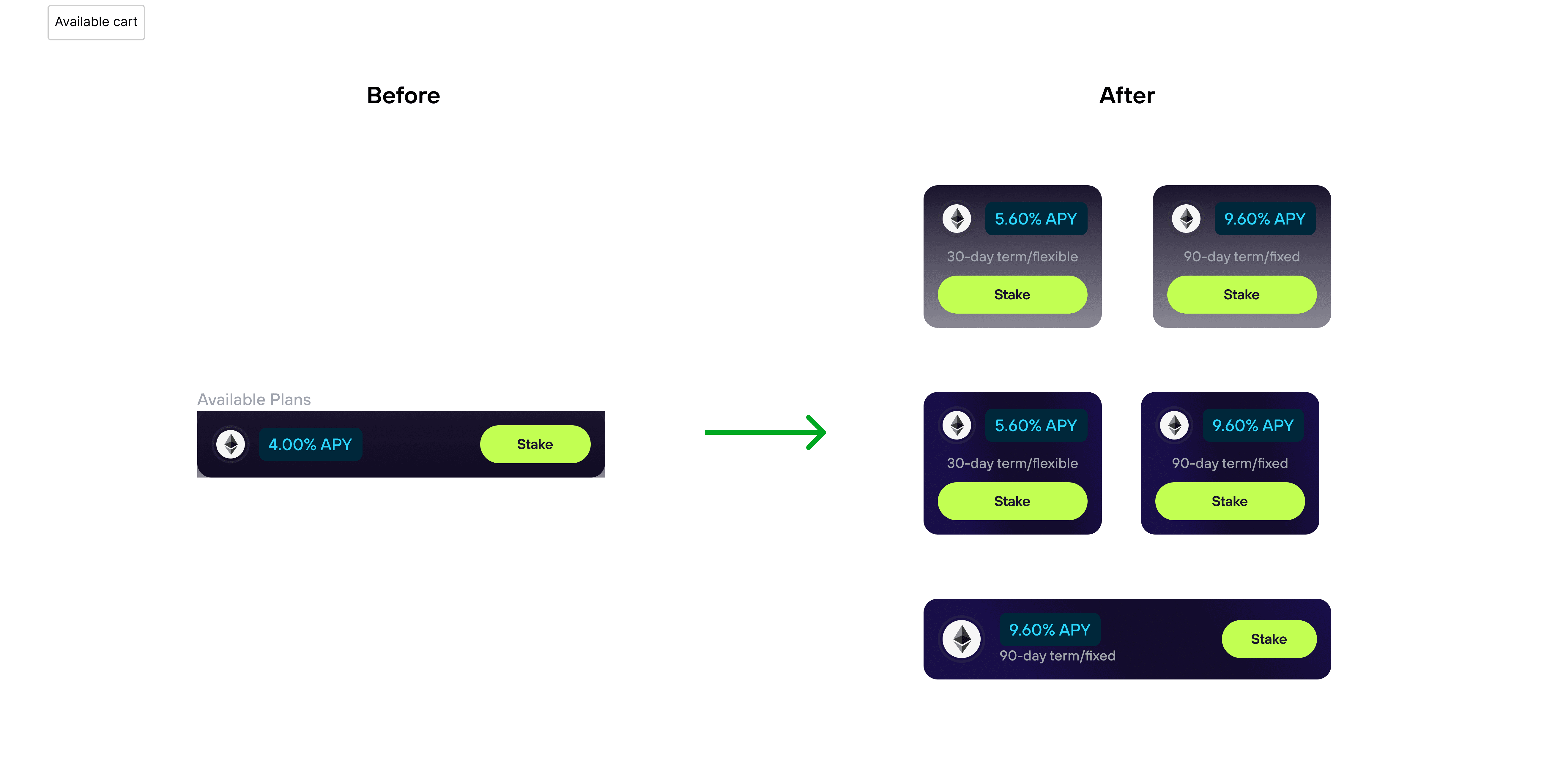
The staking journey was split across multiple screens, making it difficult to maintain context and understand progress.Unclear information hierarchy
Active and available plans were visually similar, making it hard to distinguish between what users have vs. what they can do.Disconnected decision-making
Key actions like selecting plans, choosing amounts, and scheduling were separated, forcing users to piece together decisions.Limited visibility into current state
Users could not quickly scan and understand their staking status or what actions were available.Increased friction before confirmation
Important details were spread out, reducing confidence before committing funds.
These issues introduced unnecessary complexity and increased the risk of hesitation or drop-off.

Opportunity
The main opportunity was to restructure the experience around clarity and decision-making.
Instead of guiding users through a linear, multi-step flow, the experience could:
Consolidate key actions into a more unified interface
Clearly separate active staking positions from available opportunities
Make the user’s current state immediately understandable
Reduce the number of steps required to complete staking actions
Support quicker, more confident decisions with better visibility
This approach prioritizes usability and trust—both critical in financial products.
Design Process
The redesign focused on simplifying structure, improving hierarchy, and reducing interaction friction.
Key directions included:
Restructuring the flow
The staking journey was simplified from a multi-step process into a more direct and streamlined experience.Improving information architecture
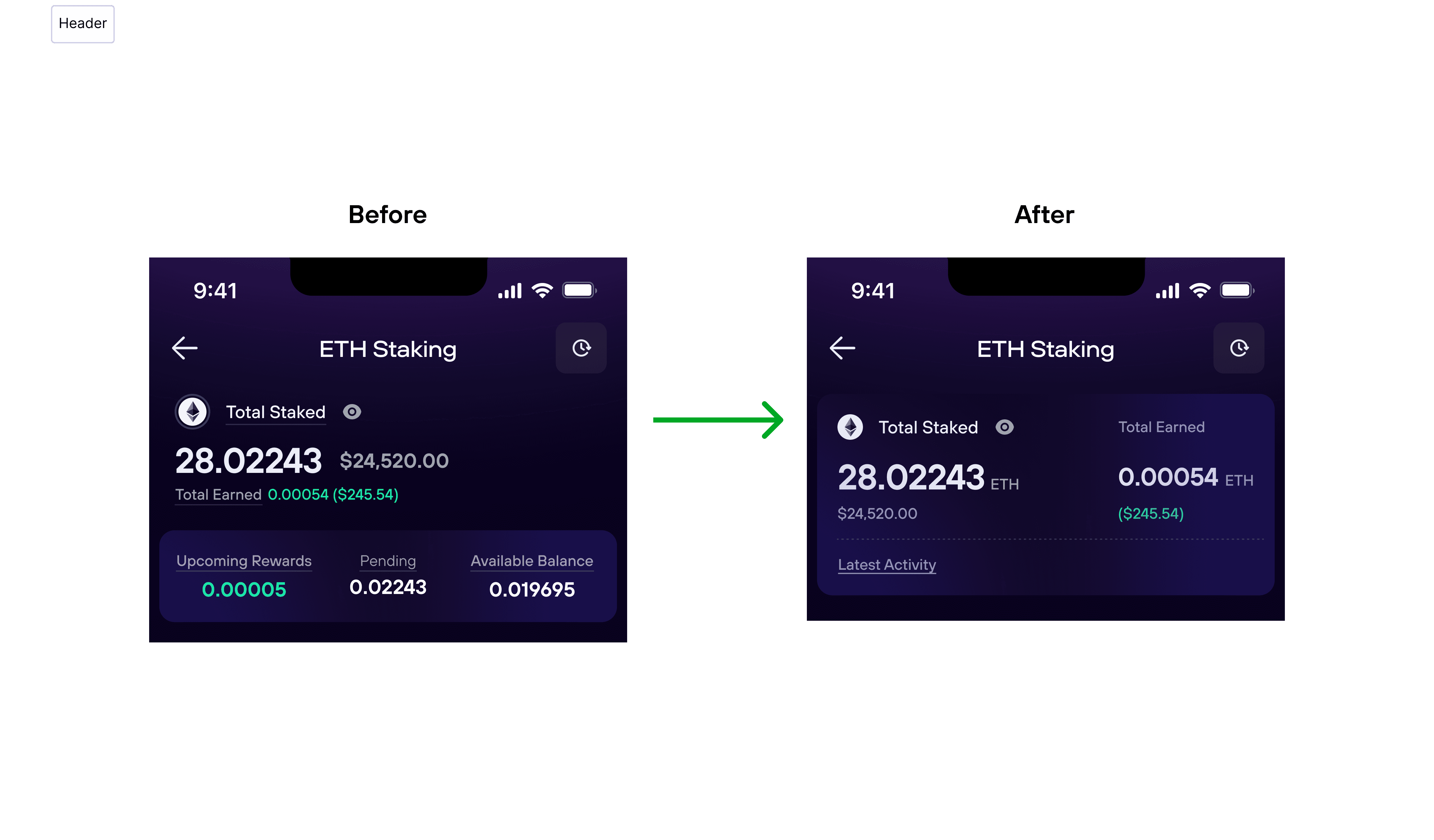
Active plans and available plans are clearly separated, making it easier to scan and understand ownership vs. opportunities.Enhancing visual hierarchy
Important information such as balances, APY, and actions are surfaced more clearly to support quick decision-making.Reducing decision fragmentation
Key inputs (like amount and scheduling) are better integrated into the flow instead of being spread across disconnected steps.Introducing quicker actions
A “quick action” approach allows users to perform common tasks (e.g., adding funds, editing schedules) without navigating through the full flow.Designing for different states
Variations such as multiple active positions, a single active position, or no available balance are handled within the same system.Exploring alternatives
Multiple solution directions were considered (improving visuals, separating sections, restructuring the full experience), with the final direction chosen for its ability to address both hierarchy and flow complexity.

Impact
The redesigned experience improves usability by:
Making the user’s current staking state immediately clear
Reducing the number of steps required to complete actions
Improving scanability through better structure and hierarchy
Enabling faster actions through contextual controls
Supporting more confident decision-making before committing funds
Overall, the experience shifts from a step-by-step process to a more intuitive, state-driven interface.
Result
The final solution delivers a simplified and more flexible staking experience that:
Combines key actions into a more cohesive flow
Clearly distinguishes between active positions and available opportunities
Supports quick actions without forcing users through full flows
Adapts to different user states (multiple, single, or no active plans)
The redesign prioritizes clarity, efficiency, and control—helping users understand their position and act with confidence.
NDAX (Crypto Staking Experience)
Overview
This project focused on improving a crypto staking experience by simplifying how users understand, manage, and act on staking decisions.
The existing flow required users to move through multiple fragmented steps (selecting assets, choosing plans, entering amounts, reviewing, and confirming), which made the experience harder to follow and increased friction—especially in a financial context where clarity and confidence are critical.
The goal was to redesign the experience to make staking more intuitive, reduce cognitive load, and help users make decisions with confidence.
Role
UI/UX Designer
Challenges
From the audit of the current experience, several key issues emerged:
Fragmented interaction flow
The staking journey was split across multiple screens, making it difficult to maintain context and understand progress.Unclear information hierarchy
Active and available plans were visually similar, making it hard to distinguish between what users have vs. what they can do.Disconnected decision-making
Key actions like selecting plans, choosing amounts, and scheduling were separated, forcing users to piece together decisions.Limited visibility into current state
Users could not quickly scan and understand their staking status or what actions were available.Increased friction before confirmation
Important details were spread out, reducing confidence before committing funds.
These issues introduced unnecessary complexity and increased the risk of hesitation or drop-off.
Opportunity
The main opportunity was to restructure the experience around clarity and decision-making.
Instead of guiding users through a linear, multi-step flow, the experience could:
Consolidate key actions into a more unified interface
Clearly separate active staking positions from available opportunities
Make the user’s current state immediately understandable
Reduce the number of steps required to complete staking actions
Support quicker, more confident decisions with better visibility
This approach prioritizes usability and trust—both critical in financial products.
Design Process
The redesign focused on simplifying structure, improving hierarchy, and reducing interaction friction.
Key directions included:
Restructuring the flow
The staking journey was simplified from a multi-step process into a more direct and streamlined experience.Improving information architecture
Active plans and available plans are clearly separated, making it easier to scan and understand ownership vs. opportunities.Enhancing visual hierarchy
Important information such as balances, APY, and actions are surfaced more clearly to support quick decision-making.Reducing decision fragmentation
Key inputs (like amount and scheduling) are better integrated into the flow instead of being spread across disconnected steps.Introducing quicker actions
A “quick action” approach allows users to perform common tasks (e.g., adding funds, editing schedules) without navigating through the full flow.Designing for different states
Variations such as multiple active positions, a single active position, or no available balance are handled within the same system.Exploring alternatives
Multiple solution directions were considered (improving visuals, separating sections, restructuring the full experience), with the final direction chosen for its ability to address both hierarchy and flow complexity.
Impact
The redesigned experience improves usability by:
Making the user’s current staking state immediately clear
Reducing the number of steps required to complete actions
Improving scanability through better structure and hierarchy
Enabling faster actions through contextual controls
Supporting more confident decision-making before committing funds
Overall, the experience shifts from a step-by-step process to a more intuitive, state-driven interface.
Result
The final solution delivers a simplified and more flexible staking experience that:
Combines key actions into a more cohesive flow
Clearly distinguishes between active positions and available opportunities
Supports quick actions without forcing users through full flows
Adapts to different user states (multiple, single, or no active plans)
The redesign prioritizes clarity, efficiency, and control—helping users understand their position and act with confidence.


